From weather maps to the surface of Mars to Doppler ultrasounds; colours and scientific data often go hand-in-hand. But did you ever consider that a combination of colours could be “unscientific”?
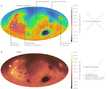
Pitfalls surrounding the use of rainbow-like colours have been known for many years – they effectively distort data and are unreadable to those with any form of colour blindness – but why are they still so pervasive in science?
Scientific colour map
Researchers from CEED and Dept of Geosciences, Uni. of Oslo and Durham Uni. explain what is a “scientific colour map,” and present free-to-download and easy-to-use solutions in an open-access paper in Nature Communications. These include, but are not limited to, rainbow-like and red–green colour maps.
In their article they present a simple guide for the scientific use of colours. We show how scientifically derived colour maps report true data variations, reduce complexity, and are accessible for people with colour-vision deficiencies.
In their new article the researchers highlight ways for the scientific community to identify and prevent the misuse of colour in science, and call for a proactive step away from colour misuse among the community, publishers, and the press.
Full article:
Fabio Crameri, Grace E. Shephard, Philip J. Heron. (2020) The misuse of colour in science communication. Nature Communications. doi:10.1038/s41467-020-19160-7
Read more on this work here:
Using better colours in science, CEED Blog, 28.10.2020
Learn more about colour maps at this YouTube film from Fabio Crameri/CEED: